Subject: The Whole Foods Recipe Search UI
Objective:
Find a recipe that I (a terrible cook) can make for dinner guests that must be gluten free and vegetarian.
The first look
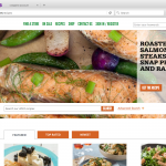 The UI is clean and pretty straight forward.
I have a number of options for starting my search.
There are two different search inputs and one with an “Advanced Search” option.
Scrolling through the page, I don’t notice anything off the bat that mentions gluten-free or vegetarian. Turns out there are a couple mentions down the page of vegetarian options but I didn’t notice them.
First search attempt:
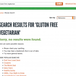 I try typing gluton free vegetarian in the second search input. The results are a little disappointing considering the input boasts 4003 recipes.
Of course, if I were to have read the error message, I might have realized that I spelled “gluten” wrong. But I’m not a “read the error message” type of guy, so I hit the back button and start looking around.
Further exploration:
Back to the recipes page and I click the “Advance Search” button and discover the filters I needed. The UI seems pretty straight forward at first. I can make selections for Gluten Free, Vegetarian, and Dinner.
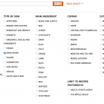 As I make my filter selections, I think that it would be nice if the UI reacted to the selections I was making. The number of available recipes could be reducing to reflect my choices instead of just disappearing. Selections that are no longer relevant could be grayed out or otherwise disabled.
Now what?
After I’ve made my filter selections, how do I get to a list of everything that is available to me? 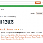 I try typing “everything” into the search input and clicking the search button. I get a recipe for Beans. Not exactly going to make for the most impressive dinner party and I can’t help but think that I may have done something wrong. Fortunate for me, I have some experience working on web based search interfaces, so I try hitting the search button without entering any terms in the input box. This does the trick! I now have a list of 88 gluten free, vegetarian main dishes to choose from.
Goal achieved… mostly
At this point, I can peruse the remaining pages of recipes exploring options that meet my criteria. I’m pretty confident that I can find something to cook.
I start reviewing the recipes and by the time I get to page 3, I realize that most of what I’m seeing is way too hard for me to cook. Going back to the “Advanced Search” UI, I see that I can also select “Quick and Easy” from the filters, run the search without a search string and I’m left with 11 recipes to choose from.
Is it just me?
When evaluating UX issues, a lot of things can be pretty intuitive. I know that some of the hurdles I ran into wouldn’t be a problem for most people. I doubt that a lot of people would type “Everything” into a search box but, I’ve seen it done in user testing for other software, so I know it can happen. The best way to know if the problems I ran into with this UI would be to run a user test. So, that’s what I did.
“With 5 users, you can discover 85% of usability problems”
– Jacob Nielson
I asked 5 people to try to find gluton free, vegetarian dinner recipes using the Whole Foods UI and found that not one user went right to the “Advanced Search” link right away.
Two users never found the filters. They stuck with input strings with varying degrees of success.
Without the spelling error, “gluten free vegetarian” yielded 7 results. “Gluton free vegetarian dinner” yielded no results”. Search strings never yielded the 88 appropriate results I got using filters.
When asked why they didn’t go straight to “Advanced Search” the test subject all assumed they were not advanced users.
Some very quick and dirty user testing has confirmed that it is not just me and the UI could use some improvements.
Proposed solutions:
Re-label the “Advanced Search” button

Based on test subject statements, simply re-labeling “Advanced Search” to say “Filter Recipes” is expected to provide the affordance needed for them to understand what capabilities are available via that link.
This is a super low cost improvement that can easily be tested to prove it’s effectiveness.
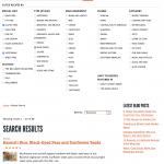
Expose filters from the start as facets
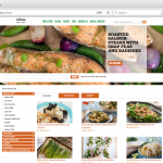 My belief is that the best solution is to expose the filters as facets to the left of the results. They could be grouped in collapsible divs with the first one opened to display the potential functionality.
The interface should update itself as the filters are applied. This would remove recipes from view as they get filtered out and the total number of results should update.
How do I know if it’s a good solution?
Present 5 new test subjects with the mocked up UI seen above and provide them with a similar task.
I would suggest modifying the test to request that the user find a Middle Eastern rice dish. If a significant number of the test subjects go straight to the facet selections, we can claim success and evaluate implementation.
How do I work with the team on moving this forward?
As we’ve seen, this looks like a solution that works for the user. Typically, that means that it’s a solution that would be approved by the product managers. I would present the problem/proposed solution to them in much the same way I have above. I’d have to be careful not to assume that my proposed solution is the end of the conversation. It’s the beginning and would have to be presented as such. If there are still questions about the measurable benefits of the proposed solutions, more extensive user testing should add the necessary clarity.
We also have to sanity check the designs with the engineers. I did the solution designs using Firebug, so many of the layout and CSS issues come with a level of implementation investigation. I find that the engineers who will ultimately implement the proposal appreciate working like this. Firebugged solutions are lightweight, flexible, and transferable with a reasonable amount of ease. Still, much of the AJAX suggested above would have to be discussed and estimated. We’re still in the early stages of the proposed solution and revision suggestions are welcome and encouraged at this point.
After all of the stakeholders have had an opportunity to evaluate and contribute their own input, we should have a pretty good idea if the idea has legs and should be implemented.
The code:
Click here to get to a .txt file with some html that can be used to replace #main on the Whole Foods Recipes page using Firebug.

